Lake Burton Civic Association | Brand Marks Refresh

Design
DELIVERABLES | Market Research, Logo Redesign, Nautical Flag Design, Apparel Design
IDENTITY DESIGN | In-Process Client Update
^
You should definitely tap through this deck… but also, scroll down, for sure.
The Synopsis
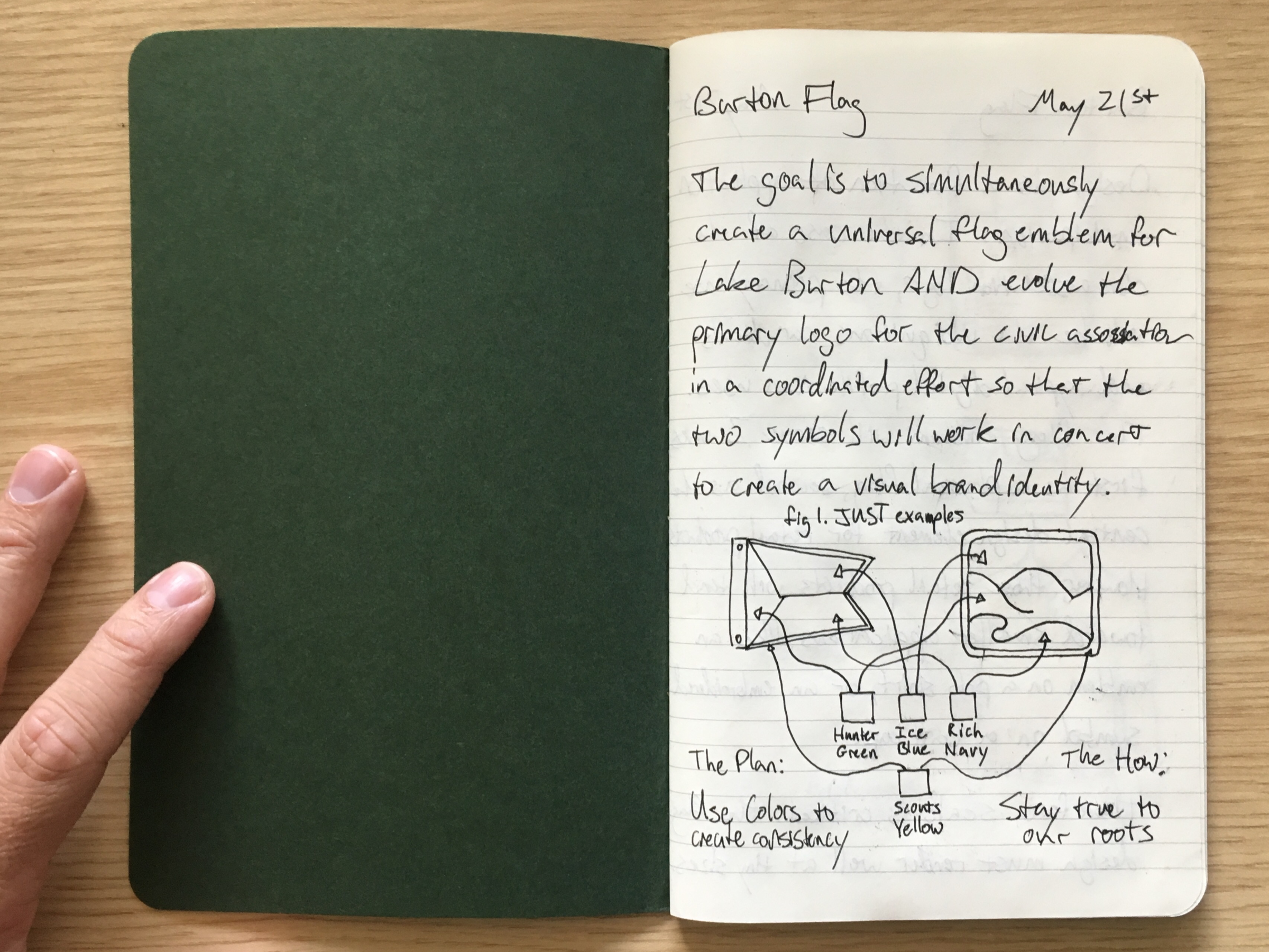
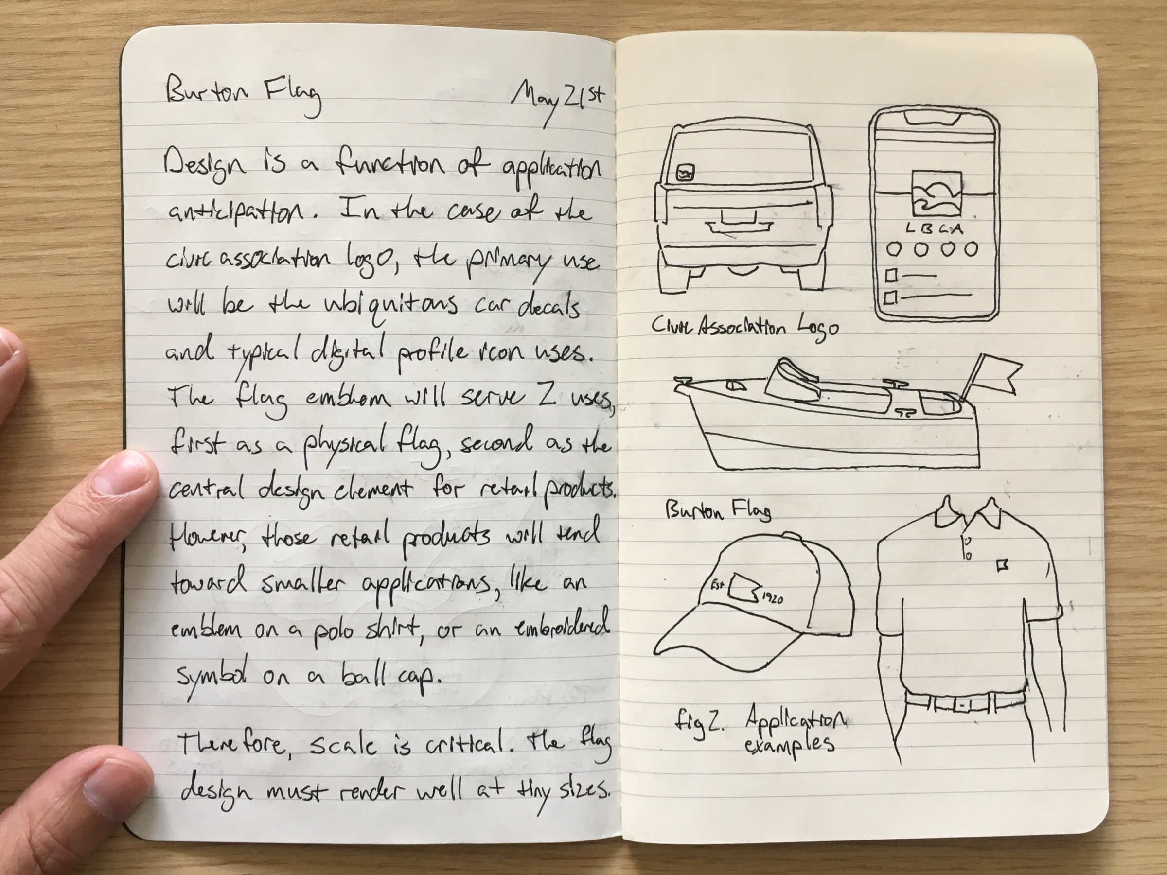
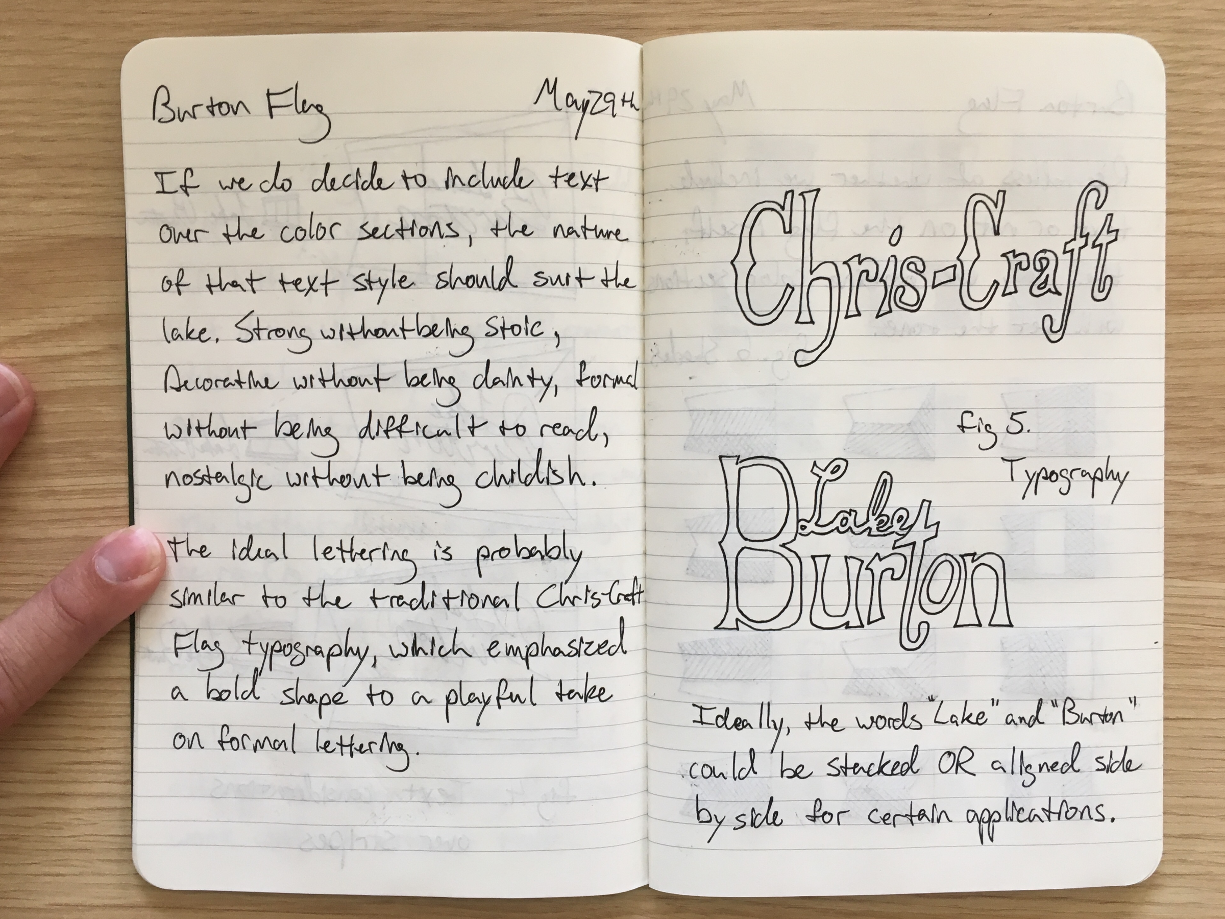
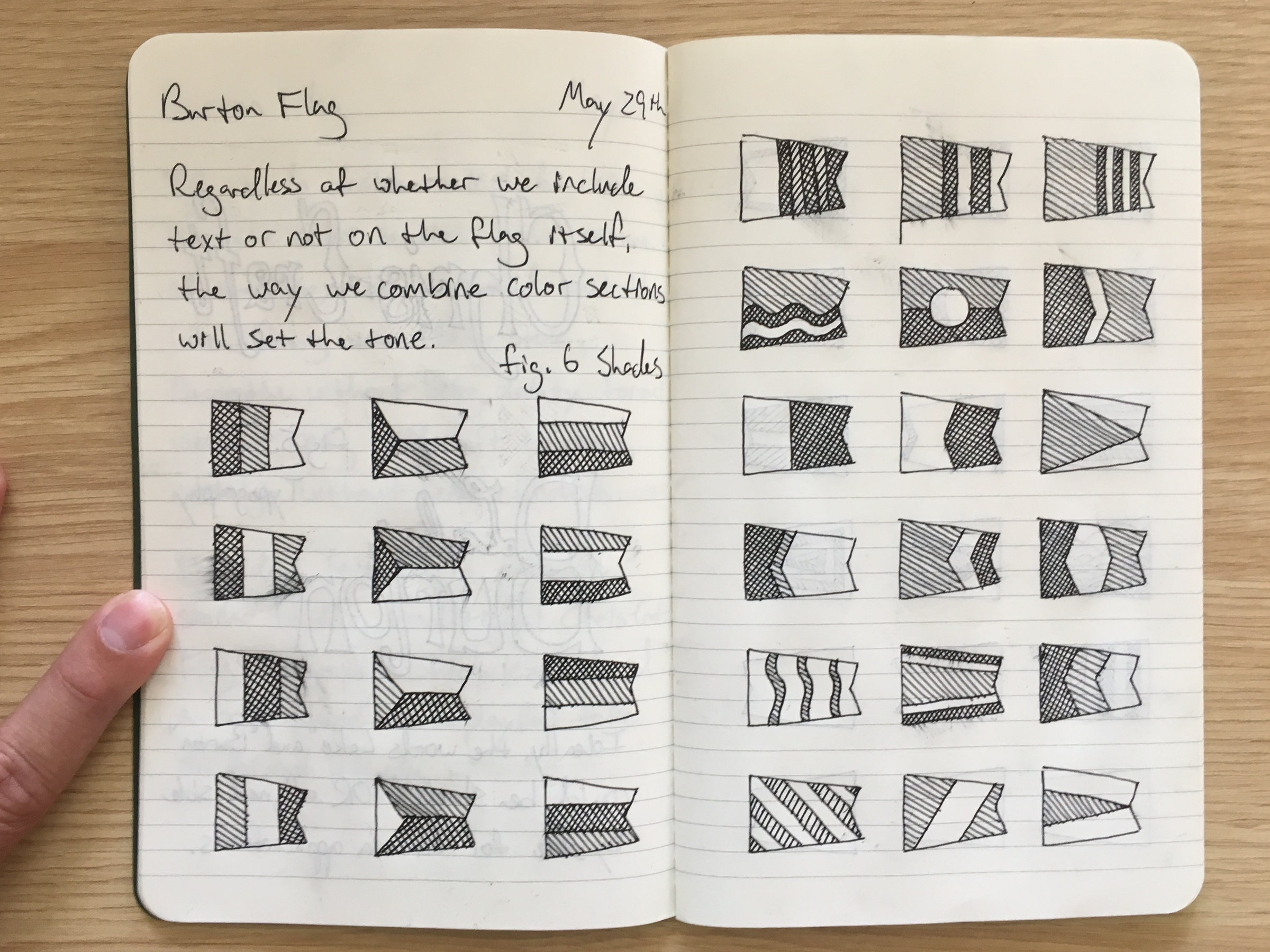
For the 100th anniversary of the lake where I spent every summer of my life, I was commissioned by the local civic association to update their iconic logo and to design the official nautical flag of Lake Burton along with some related merchandise.
Despite mismanaging the communication, the actual design work was smart and well-received, and the final product was a big hit—the flags are currently flying from boats and boathouses across the lake and the decals are proudly displayed on the SUV’s of homeowners across Atlanta.
What I did right
This was a complicated juggling act that I managed really well from the design side.
On the one hand, the iconic civic association logo had to have its essence preserved while evolving to solve some legibility and scalability issues, amongst other contextual problems, without losing decades of brand equity as the most recognizable symbol associated with the lake.
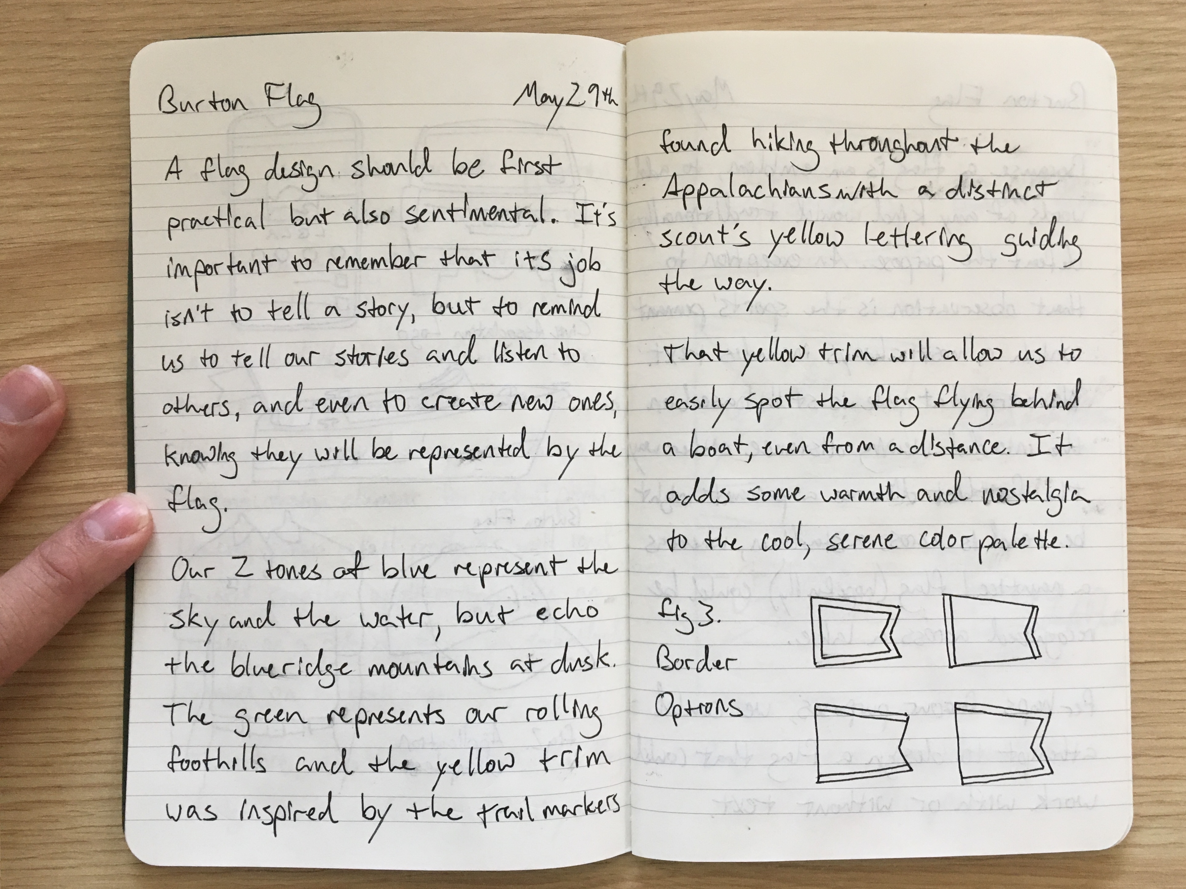
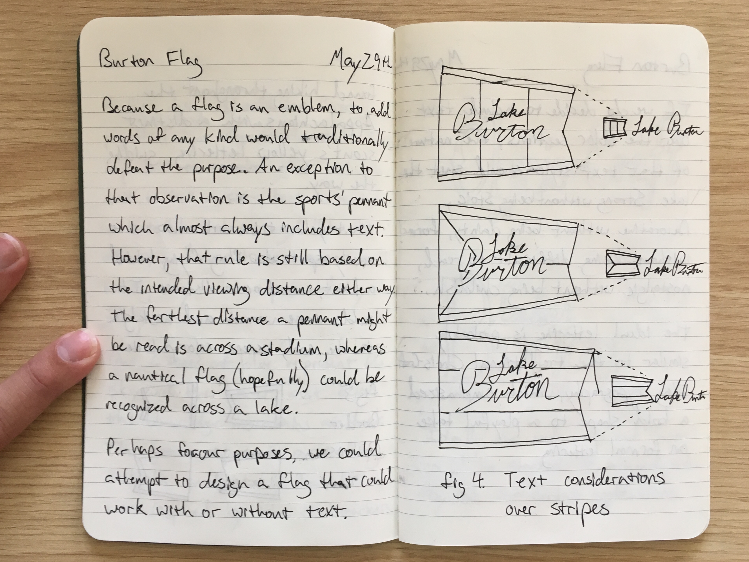
On the other hand, a flag had to be designed that not only represented 100 years of history for a proud rural vacation community with roughly 1200 homes and the thousands of lake life enthusiasts it represented but also rose to the occasion of carrying the community far into the next 100 years with a truly timeless design.
What I did wrong
A lot. It began with not maintaining the boundaries I set in the beginning. But it ended with burning a bridge and badly damaging a key relationship because of my lack of communication when I was frustrated.
Although I laid out the standards I expected for the committee that I was willing to present to and take feedback from, I didn’t confirm its existence, much less vet the individuals.
So what began as a delicate marketing attempt to thread a needle, quickly devolved into navigating design-by-committee hell, complete with random board members mocking up ideas in Microsoft Word. I should have shut it down quickly and established a better presentation process, instead of letting the point of contact forward my presentations around to any and everyone for feedback.
My response was to present less, and communicate less, until I was so frustrated toward the end of the process, that I stopped communicating entirely after finishing the lion’s share of the work—I left the final decisions on color palette to the civic association and washed my hands of the whole process. And while I’m happy with where they landed on trim colors, I do regret burning that bridge.